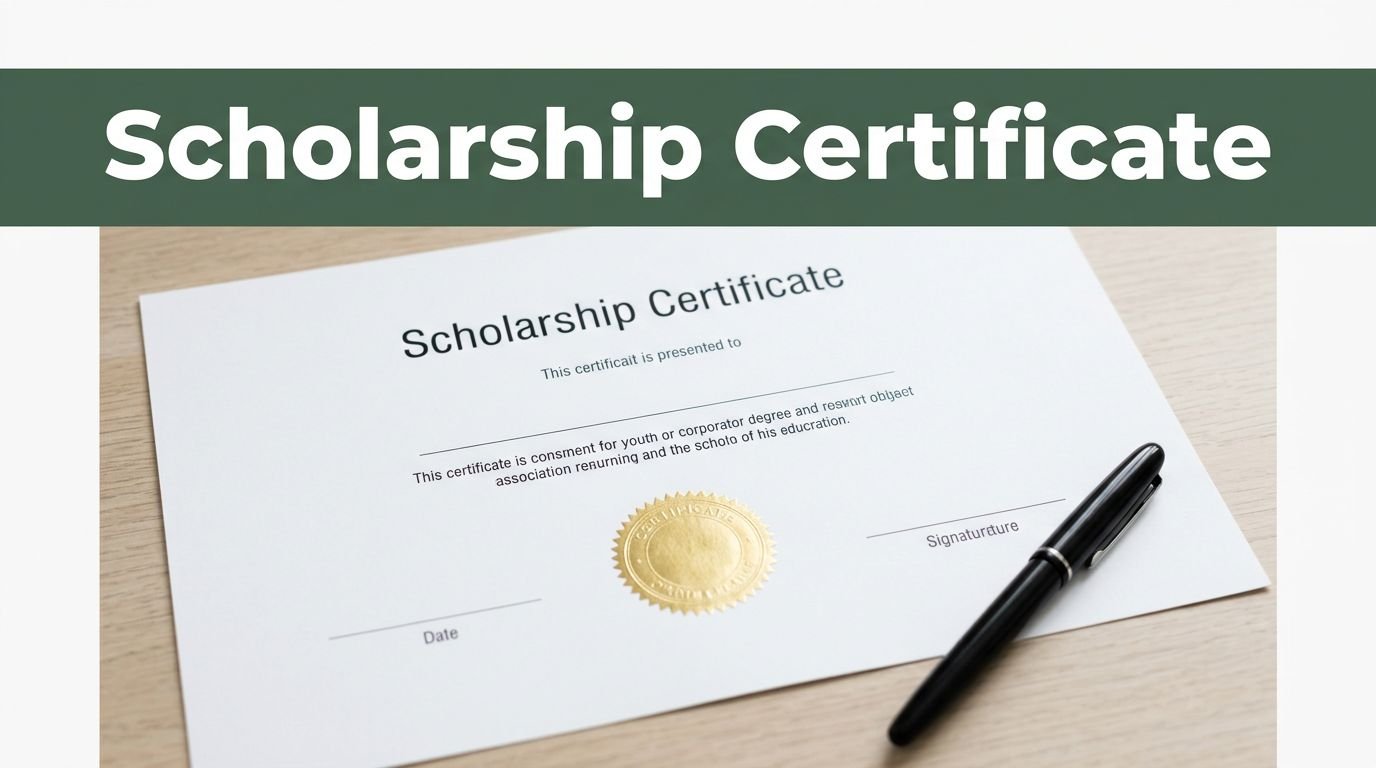
A certificate of scholarship sample gives you a clear picture of how a scholarship certificate should look, what it should say, and who usually uses it. You’ll see these samples used by schools, donors, scholarship programs, and sometimes students who need a formal, credible version they can trust.
If you’re trying to make one from scratch, the hard part is often the wording and layout, not the idea itself. A good sample keeps things clean, professional, and easy to adapt, so your certificate looks official instead of thrown together.
In the next section, you’ll see the parts that make a scholarship certificate look polished, the wording it should include, and how to adjust it for different uses.
What a scholarship certificate should include
A scholarship certificate needs more than a nice layout. It should tell the reader exactly who received the award, what it was for, and who issued it. If those details are missing or vague, the certificate looks unfinished, and worse, it can create questions later.
When you look at a certificate of scholarship sample, the strongest versions are simple, direct, and easy to verify. That usually means clear names, accurate award details, and a few official touches that make the document feel real.
The student’s full name and scholarship name
Start with the recipient’s full name, and make it exact. That means spelling, order, and spacing should match the student’s official records. A small mistake here can cause confusion, especially if the certificate is used for school files, job applications, or future verification.
The scholarship name matters just as much. Use the official award title, not a shortened version or a casual label. If the award is called “Merit Scholarship Award,” keep it that way. Matching the official name helps people connect the certificate to the right program right away.
A clean certificate makes both details easy to read at a glance. You want the student’s name and scholarship title to feel like the headline of the document, not something buried in the middle.
Award details that prove the certificate is real
A scholarship certificate should show more than who got the award. It should also explain why the award was given, who issued it, and when it was awarded. That gives the document context and makes it easier to trust.
The most useful details include:
- The reason for the award, such as academic merit, financial need, or leadership
- The name of the school, foundation, or organization that issued it
- The date the scholarship was awarded
- A certificate number or ID, if the program uses one
These details do a lot of work. They help with recordkeeping, make later checks easier, and give the certificate a proper paper trail. If someone needs to confirm the award months or years later, the information is already there.
If the details don’t match the official records, the certificate loses credibility fast.
Official touches that make it look professional
The right presentation can change how a certificate feels in a second. A logo, seal, and signature all add weight because they show the document came from a real source, not a random template.
A clean layout matters too. Keep the spacing balanced, the text easy to scan, and the page free from clutter. You want it to feel formal, not crowded. Too many decorative elements can make the certificate look busy and distract from the important parts.
A professional certificate usually includes:
- A school or organization logo near the top
- A signature from an authorized person
- A seal or stamp, if your institution uses one
- A layout that keeps the main details front and center
When you use a certificate of scholarship sample, the goal is simple: it should look official the moment someone opens it. Clear details and a tidy presentation do that better than flashy design ever will.
How to write the wording on a scholarship certificate
The wording on a scholarship certificate should feel formal, but not cold. You want it to read like an honest recognition of achievement, not a legal document packed with extra fluff.
Keep the message short, clear, and polished. If the text sounds warm and direct, the certificate feels more personal, and that matters just as much as the design.
Simple wording that sounds formal but easy to read
Start with plain language. A scholarship certificate does not need dramatic lines or long explanations, it just needs to say who is being recognized, what they received, and why it matters.
A good certificate reads smoothly and gets to the point fast. You can keep it respectful without sounding stiff by using phrases like “awarded to,” “in recognition of,” or “for outstanding achievement.”
Here’s the kind of tone you want:
This certificate is awarded to [Student Name] in recognition of outstanding academic achievement.
That works because it is direct and polished. It celebrates the student without overloading the page with extra wording.
If you’re working from a certificate of scholarship sample, think of the text like a good handshake, firm, brief, and easy to trust. The best wording leaves space on the page and space for the accomplishment to stand out.
Best phrases to recognize achievement or support
The wording should match the reason for the scholarship. A merit-based award should sound different from a need-based grant, and a leadership scholarship should feel different from one tied to community service.
A few common phrases can help you match the message to the award:
- For academic merit: “in recognition of academic excellence” or “for outstanding scholastic achievement”
- For leadership: “for demonstrated leadership and initiative” or “in recognition of exceptional leadership”
- For service: “for dedicated service to the school and community” or “in appreciation of meaningful volunteer work”
- For financial support: “to support continued educational pursuit” or “in recognition of need-based assistance”
- For general achievement: “for excellence in the pursuit of education” or “for distinguished performance”
The point is to keep the phrase aligned with the scholarship purpose. If the award celebrates service, don’t phrase it like a grade-based prize. If it supports tuition, don’t make it sound like a competition trophy.

A simple wording structure often works best:
- Name the recipient.
- State the scholarship or award.
- Explain the reason for the award.
- Add the date or issuing body.
That keeps the certificate readable and makes the message feel complete without becoming crowded.
What to avoid in the certificate text
A scholarship certificate can lose trust fast if the wording feels sloppy. Even a small spelling error can make the document look rushed, and vague wording makes it harder to take seriously.
Watch out for these common mistakes:
- Spelling and grammar errors: One wrong name or broken sentence can weaken the whole certificate
- Vague language: Phrases like “for being great” or “for doing well” do not say enough
- Too much text: Long paragraphs make the certificate look crowded and hard to scan
- Informal wording: Casual phrases can make the certificate feel less official
- Mixed messages: The reason for the scholarship should be clear and consistent throughout
If the wording feels bloated, cut it down. If it sounds casual, tighten it up. A scholarship certificate should feel credible at first glance, and clean text does most of that work for you.
A simple rule helps here, if you wouldn’t sign the wording on official letterhead, it doesn’t belong on the certificate. Keep it crisp, keep it accurate, and let the award speak for itself.
A scholarship certificate sample you can adapt for your own use
A good certificate of scholarship sample gives you a working structure, not just a pretty design. It shows you where each detail belongs, how much text to use, and how to keep the page clean enough to feel official.
If you keep the layout simple, the certificate does most of the work for you. The title, recipient name, award statement, issuing group, date, and signature line should all be easy to spot at a glance.

Sample layout for a student award certificate
Start at the top with a clear title, such as Scholarship Certificate or Student Award Certificate. Right below it, place the name of the school, foundation, or organization issuing the award.
In the center of the page, put the student’s full name in the largest text. That name is the focus, so it should stand out immediately. Under that, add a short award statement, such as “for academic excellence” or “in recognition of outstanding achievement.”
Finish with the basics at the bottom:
- The issuing group or institution name
- The date awarded
- A signature line for an authorized official
That order keeps the certificate easy to read and easy to trust. You don’t need a crowded page, you need a clean one that feels intentional.
How to personalize the sample for different scholarship types
The same template can fit different awards with just a few wording changes. You don’t need to rebuild the whole certificate every time, you just need to match the message to the scholarship.
Here are simple ways to adjust your scholarship certificate sample:
- Merit-based scholarship: Use wording like “for outstanding academic performance” or “in recognition of excellence in study.”
- Need-based award: Use a softer line like “for support in continuing education” or “in recognition of financial need and academic promise.”
- Sports scholarship: Mention “for athletic achievement” or “for commitment and excellence in sports.”
- International student support: Use wording like “for academic progress and global student support” or “in recognition of international study achievement.”
Keep the wording tied to the reason for the award. If the message and the scholarship type don’t match, the certificate feels off.
You can also adjust the tone. A university award may sound more formal, while a school fundraiser certificate can feel a little warmer. The layout stays the same, but the words should fit the setting.
Where to place names, dates, and signatures
Placement matters more than most people think. If the details are scattered across the page, the certificate looks messy, even if the text itself is correct.
Put the recipient’s name near the center, where the eye naturally lands first. The date usually works best at the lower left or lower center, while the signature line sits at the lower right or directly beneath the issuing authority’s name. This gives the certificate a balanced shape instead of a lopsided one.
A few simple spacing habits help a lot:
- Leave enough room around the name so it stands out
- Keep the award statement short and centered
- Separate the bottom details so they don’t crowd each other
- Align the signature line with the issuing group or official title
Neat spacing makes the final document feel more official. It also makes the certificate easier to scan, which matters if someone needs to read it quickly during filing, verification, or review.
When you build from a clear scholarship certificate sample, you get a document that looks polished without feeling overdesigned. That balance is the sweet spot, clean enough for beginners to follow, formal enough to use with confidence.
Design tips that make your scholarship certificate look credible
A scholarship certificate does not need a flashy layout to look official. In fact, the more polished versions usually feel calm, balanced, and easy to read. If the design is doing too much, the message gets lost.
You want the certificate to look like it belongs in a school file, an admissions folder, or a frame on the wall. That means every visual choice should support the award itself, not compete with it.
Fonts, spacing, and colors that work well
Choose fonts that are easy to read at a glance. A clean serif font can feel traditional and academic, while a simple sans serif font gives the page a neat, modern finish. Stick to one or two fonts only, because too many typefaces make the certificate look busy.
Spacing matters just as much as the font. Leave enough white space around the title, recipient name, and award statement so the page can breathe. Tight spacing makes the certificate feel cramped, while open spacing gives it a more confident look.
Color should stay calm and formal. Think dark text on a light background, or a soft accent color paired with neutral tones. Bright shades and heavy gradients usually distract from the award, and that is the last thing you want.

A good rule is simple, the design should support the message, not fight it. If someone notices the border before they notice the student’s name, the layout is doing too much.
A clean visual setup usually includes:
- One main font for the title and body text
- A second font only if it adds contrast without confusion
- Consistent line spacing
- Clear space around the main details
- A restrained color palette with one accent tone
Using logos, seals, and borders the right way
Small details can make a scholarship certificate feel official without making it crowded. A school logo, an organization seal, or a thin border adds structure and gives the document a more finished look. The trick is to use these elements with restraint.
Put the logo where it fits naturally, usually near the top. Keep it sized properly, so it identifies the issuer without taking over the page. A seal or stamp works best when it looks like part of the document, not an afterthought pasted into a corner.
Borders should stay simple. Thin lines, light decorative edges, or a formal frame can work well, but heavy patterns often distract from the text. The same goes for seals and icons, they should support the scholarship, not crowd it.
If the award comes from a school, foundation, or club, the design should match that organization’s style.
That means the colors, logo placement, and border style should feel consistent with the brand or institution behind the certificate. A university certificate should not look playful. A community award should not look overly ornate. Matching the source builds trust fast.
Printable and digital versions you should prepare
It helps to prepare both a print-ready version and a digital copy. Some people want to frame the certificate, while others want to save it on their phone, email it, or upload it for records. If you only have one format, you make the document harder to use later.
A print version should be high-resolution and set up for standard page sizes. That keeps the text sharp and the logo clear when it comes off the printer. A digital version should be easy to share and store, with a clean file name and a layout that still looks good on screen.
A simple two-format setup works best:
- A print-ready PDF for official use and archiving
- A digital copy for sharing, saving, and quick access
This matters because many recipients do not use a certificate only once. They may need it for scholarship records, job applications, online profiles, or future verification. If your certificate of scholarship sample works in both formats, you give it more practical value without changing the design.
Keep both versions consistent. The wording, spacing, and visual details should match, whether the certificate is printed or viewed on a screen. That way, the award looks credible no matter how it is opened.
Common mistakes to avoid when making a scholarship award certificate
A scholarship award certificate should feel clear, official, and easy to trust. When it misses key details or looks rushed, the whole document loses weight fast. You don’t need a fancy setup, you need a certificate that people can read, verify, and keep without second-guessing it.
Missing details that weaken the certificate
Leaving out basic information is one of the fastest ways to make a certificate feel incomplete. If the student’s full name is missing, or the scholarship title is vague, the document stops being useful. The same goes for the date, the issuing organization, and the signature, because those details help prove the award is real.
A certificate without clear source details can also cause problems later. If someone needs to confirm the award for school records, admissions, or a job application, they may not know who issued it or when it was granted. That makes verification harder than it should be.
At a minimum, your certificate should include:
- The student’s full legal name
- The official scholarship or award name
- The issuing school, foundation, or organization
- The award date
- A signature or authorized name
When any of those pieces are missing, the certificate starts to look like a draft instead of an official record.
Overly busy layouts and hard-to-read text
A scholarship certificate does not need every font, color, and border you can find. Too many design elements turn the page into a mess, and that makes the important details harder to spot. If the eye has to fight through decorations, the message gets lost.
Clean presentation always works better than clutter. Use one or two fonts, keep the spacing balanced, and let the student’s name stand out. Bright colors, heavy shadows, and crowded graphics often do more harm than good.
A simple rule helps here, if the design pulls attention away from the award itself, it’s doing too much. The certificate should feel polished, not noisy. Think of it like a framed photo, the frame should support the picture, not steal the show.
Copying a sample without checking the facts
A certificate of scholarship sample is a starting point, not a finished file you can send as-is. If you copy it without checking names, award titles, dates, or the signer’s details, you risk printing a certificate with mistakes that are hard to fix later.
Spellings matter more than people think. One wrong letter in a student’s name or one incorrect scholarship title can make the certificate feel careless. That’s the kind of error that stands out the second someone reads it.
Before you print or share anything, check these items one more time:
- Student name spelling
- Scholarship name and wording
- Date of award
- Issuing organization name
- Signature line and title
A quick final review saves time, money, and embarrassment. If you’re using a certificate of scholarship sample, treat it like a template that still needs your facts, not a finished document that’s ready without changes.
When to use a certificate of scholarship sample for your program
A certificate of scholarship sample is most useful when you need a polished award document without starting from zero. It gives you a ready structure for names, award details, signatures, and branding, so you can move fast without making the certificate feel generic or thin.
You’ll get the most value from a sample when the award needs to look official, repeatable, and easy to verify. That matters whether you’re handing it out at a ceremony, sending it by email, or keeping it on file for later proof.

For school and college scholarship awards
Schools and colleges use scholarship certificates to recognize students in a way that feels clear and formal. You can hand one to top students, financial aid recipients, or anyone who earned a special academic award. It gives the achievement a visible record, not just a line in a gradebook.
This works well for end-of-term honors, graduation events, department awards, and merit-based scholarships. A student who earned support for strong grades, leadership, or community service should get a certificate that names the achievement plainly. That way, the award feels real the moment they receive it.
A school can also use a certificate when the scholarship is tied to a specific purpose, like tuition support, research excellence, or a subject-specific prize. For example, “Outstanding Biology Student Award” or “Dean’s Merit Scholarship” tells the story right away. Simple wording makes the award easier to remember and easier to file.
A certificate works best when it matches the award exactly, not when it tries to sound bigger than it is.
For nonprofit, donor, or private scholarship programs
Outside organizations use scholarship certificates to build trust. When a nonprofit, donor group, or private foundation issues an award, the certificate helps the recipient see that the program is legitimate and well-run. It also gives the award a more formal finish, especially when the money comes from a smaller or newer program.
A consistent certificate style helps here too. If you use the same logo placement, font, wording, and layout across every award, people begin to recognize the program faster. That kind of consistency supports brand awareness and makes the scholarship look established, even if the program is still growing.
This is especially helpful for donor-sponsored events, annual community scholarships, and private education funds. You can include the organization name, a short award statement, and the donor or sponsor line if needed. That keeps the certificate personal without making it cluttered.
A good sample also helps when you need to issue multiple awards in one cycle. You can keep the format the same and only update the recipient details. That saves time and keeps every certificate aligned with the same visual standard.
For digital sharing, records, and future reference
A scholarship certificate is not only for the ceremony. You’ll often need it later, and that’s where a sample becomes practical. It gives you a clean document you can save, email, upload, or print again when someone asks for proof of recognition.
Students may need the certificate for employers, internship applications, scholarship portfolios, or school records. In those cases, the document acts like a quick reference sheet that shows the award was real and officially issued. If a hiring manager or admissions office asks for proof, the certificate is ready.
It also helps with internal recordkeeping. Schools and scholarship programs can store the certificate alongside award lists, date records, and recipient files. That makes future checks easier, especially if someone needs to confirm the scholarship name or award date.
A practical certificate setup usually works for these uses:
- Sharing by email or download link
- Adding to a student portfolio or CV attachment
- Keeping a copy in school or donor records
- Reissuing the certificate if the original is lost
If you’re using a certificate of scholarship sample for digital use, keep the file clean and readable on screen. A good certificate should look just as solid in a folder on your desktop as it does in a frame on a wall.
Conclusion
A strong certificate of scholarship sample keeps the basics clear, the wording formal, and the layout easy to trust. When you include the student’s full name, the scholarship title, the date, and the right signature details, the certificate feels complete instead of rushed.
Clean design matters just as much. A simple certificate with balanced spacing and readable text gives the award more weight, and that makes the scholarship feel more meaningful from the moment it is handed over.
If you keep the message short and the facts accurate, you end up with a certificate people can actually use and remember. That is the difference between a plain template and a document that feels official.
This post may contain affiliate links. If you make a purchase through these links, I may earn a small commission at no extra cost to you.